
Hair Artistry: A Rebranding Case Study
Project
Brand refresh for a local family run hair salon.
Client
Hair Artistry Salon Studio
Roles
Strategy, Branding, Art Direction, Web Design, Marketing Materials
The Opportunity
Peggy and Carolyn came to me seeking an updated logo for their business. Through our initial conversation, they decided they needed help finding a voice for their brand instead.
The sisters had taken over their mother’s salon in 1995, formally known as Lads and Lassies. The salon had a history serving the community as a family-friendly place and on any given day you might see a men’s cut going on right next to grandma’s weekly hot set. The original business had its own brand confusion so the sisters moved to rename as Hair Artistry in 2006 to be more aligned with their market while giving respect to their heritage. The new branding was stitched together with mismatched styles resulting in a lack of cohesiveness in their marketing attempts. The sisters felt the salon was undefined and aging in a competitive trendy market. They wanted the salon’s brand to reflect the expertise and value of the stylists and be welcoming to all the generations they served. With two points of view, it was important that they unified their perspectives to create one voice.

The Solution
I lead the sisters through a discovery process to help them realize their core values and define the personality of the Hair Artistry experience. I started by interviewing them about the business, their ideal clientele, and their personal style preferences. This discussion lead to a set of mood boards that were crafted in relation to their feedback. As we honed in on the different elements, the results guided me through the visual identity development process.
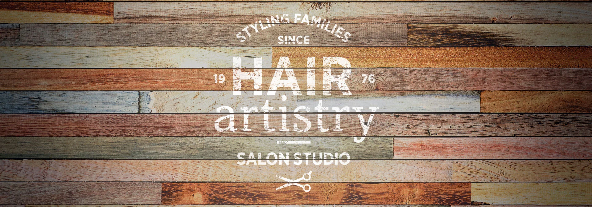
Now that the mood was set, I began developing logos that fit the tone of their chosen design style. Early feedback led to the conclusion that they had preference for the original logo and we moved forward with giving it a face lift. I kept to the initial layout structure but found a more timeless font pairing while keeping it bold and inviting. We introduced a secondary identifier to give nod to the artist’s space and add a deeper level of clarity: Hair Artistry is a team of stylists using the medium of hair to sculpt and paint into custom works of art.
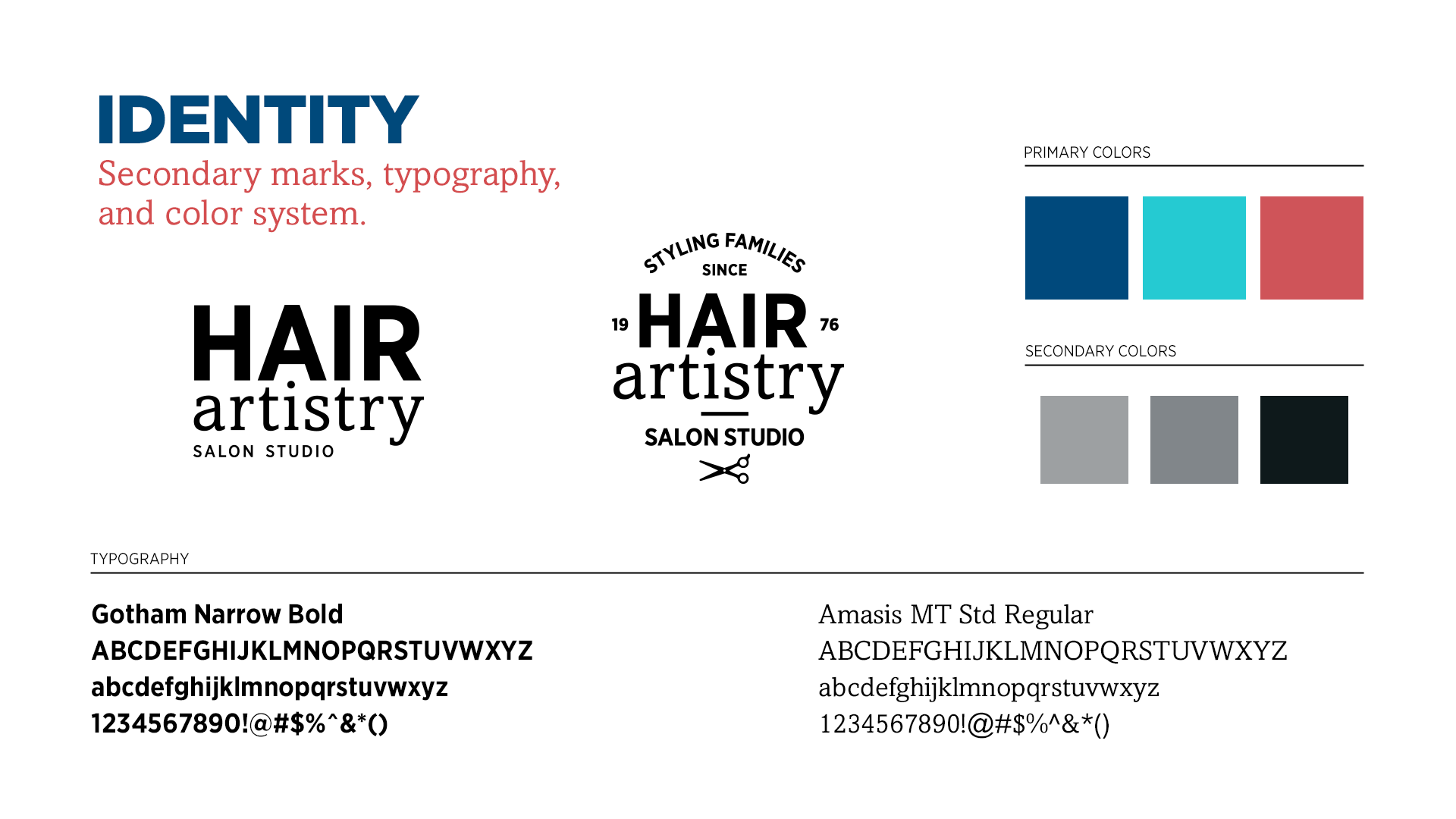
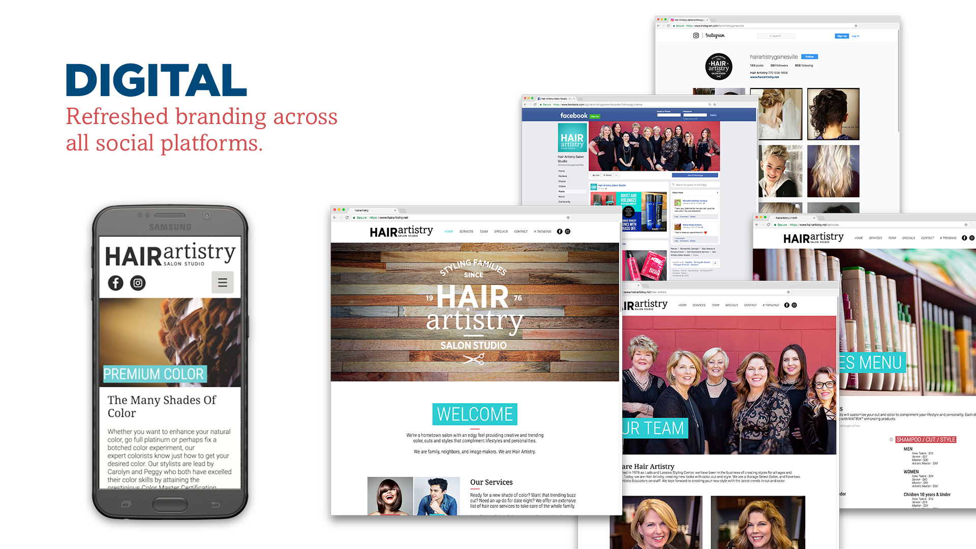
Once the logo had been finalized an identity system was created with a set of guidelines for treatment and usage. This toolkit was used to build promotional and marketing collateral for both digital and print medias. Secondary marks, typography and a color palette were established. With a strong horizontal hero logo, alternative versions were provided to give more options when there were design restrictions: a stacked version of the logo and a stamp mark. The stamp mark pertained to the well-established history the salon has in serving its community and is featured prominently on the entrance wall of the salon.

The Outcome
Through the discovery process the sisters realized that a new logo wasn’t the answer to their branding issues. They used the results to help guide them through an entire salon design refresh, updating their physical space and re-evaluating client engagement to match the spirit of their brand. They saw more online engagement, reached a new market gaining clients, and heard more positive client feedback during salon visits.

The Feedback
“We are in an industry that needs to stay current. It had been 11 years since our last rebranding and it was feeling out dated. Deanna came up with a solution that truly represented us. Carolyn and I answered questions separately so we could get non-biased answers. Deanna took what we gave her and combined our point of views into different options. When we narrowed down the options, she was able to focus on the direction we all agreed on. She allowed us to pick and choose, and interjected her expertise to guide us, but we made the final approvals. Deanna was great to work with and our clients love the new look.” — Peggy Copeland
"Deanna first captured our thoughts through questions that made us think about our business outside the box. She dug deeper into our minds with clarification of our answers. Then she put together color and texture to our expressed moods with multiple branding options. She got our story. Seeking our gut reactions to everything we saw, she instinctively knew how to guide us. We had a sit-down, face-to-face meeting that she was super prepared for with story boards and examples to show. She anticipated ideas we might move toward and offered so many options. The products she offered were crisp and smart from just the right font to just the right colors." — Carolyn Adams